
plantUML revisited
Two days ago, a plantUML tweet caught my attention:
Someone is willing to pay for a plantUML diagram. That’s something I haven’t seen before, so I checked what it was all about: the following diagram needed to be implemented as plantUML…
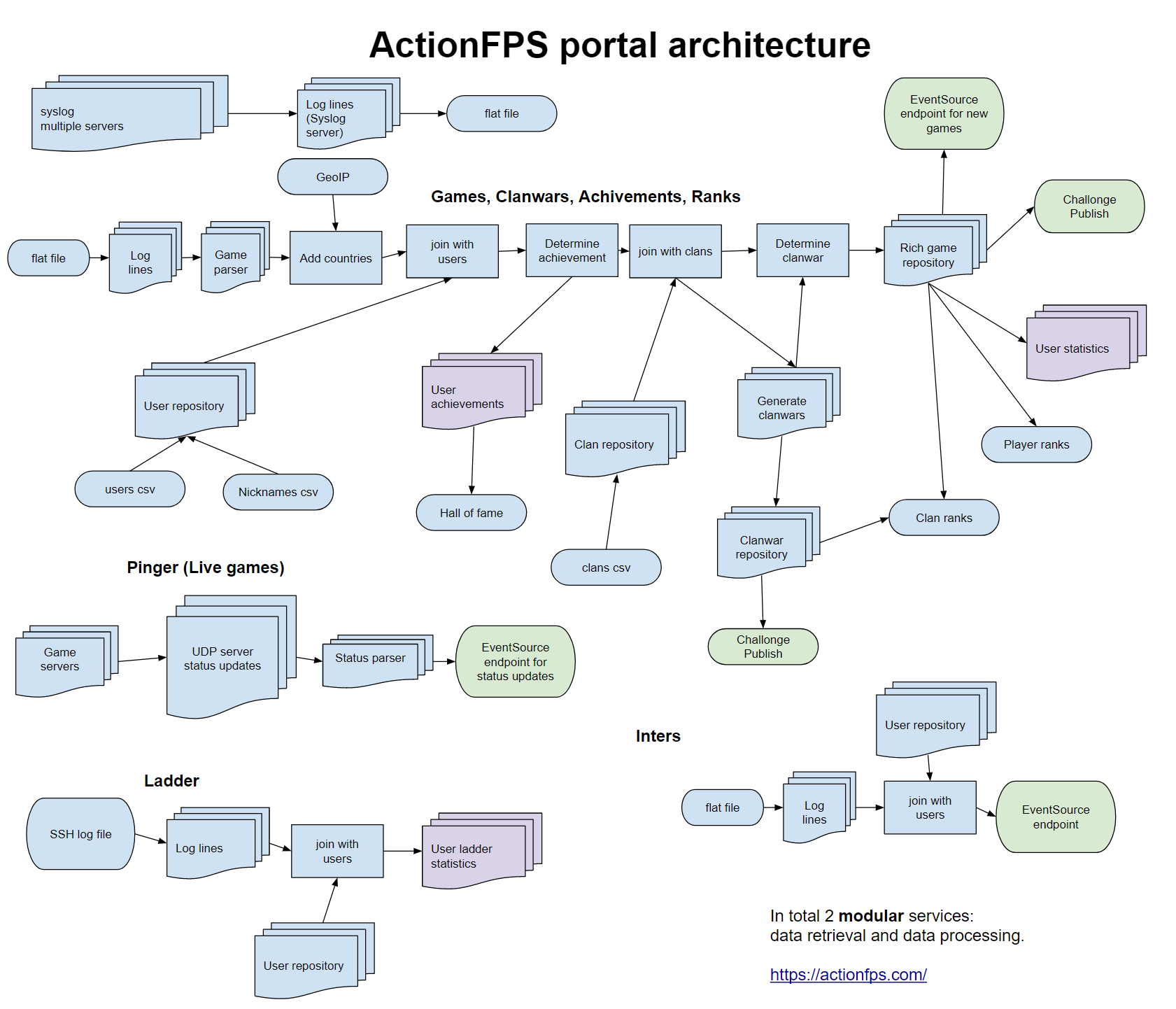
The money caught my attention, but what made me to do the work was the following. When I advise about plantUML, I always tell people that - because you don’t have control over the layout - is great for sequence diagrams but hard to use for complex diagrams of other types.
Now, here it was - a complex architecture diagram and the chance to give it a try for the value of three beers! 🍺🍺🍺
Here is what I’ve learned from this:
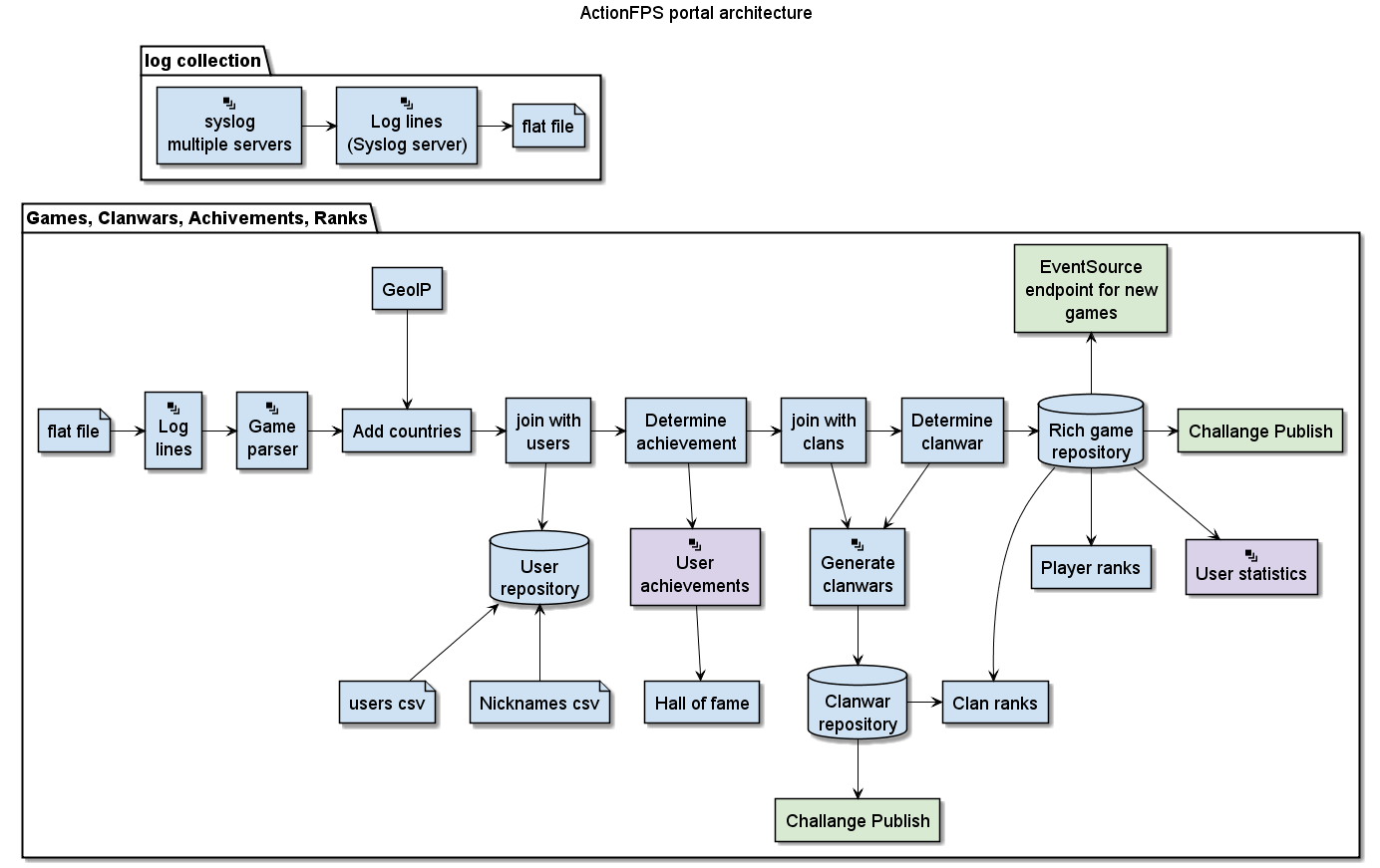
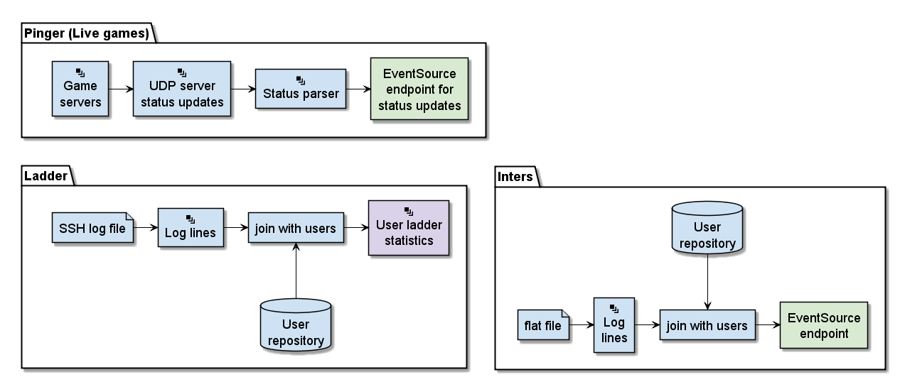
different tools use a different visual language
plantUML has no icon saying "these are multiple instances". But from the names of the elements, I deducted that I could use the database symbol for the repositories and the file symbol for the csv elements.
I was missing a visual legend
while the meaning of the csv and repository elements is clear to me, I have no clue about the color codes or the rounded shapes of the diagram. I guess others have the same problem with my diagrams. So always try to create a legend which explains the visual hints.
when you have an existing diagram, you can easily describe your plantUML code to look like the original diagram
By only using the -> (right) and --> (down) arrows, I already achieved most of the layout.
Sometimes I had to reverse the arrow direction <-- to keep the meaning "down" but draw the arrow the other direction (I normally switch the two elements and do not reverse the arrow).
but the layout can be a beast…
Have you noticed that the plantUML consists of two images? That is because even with hidden lines, I didn’t manage to put those diagrams underneath each other. PlantUML always rendered them side by side.
Conclusion
While I managed to redraw the given diagram with plantUML, I wouldn’t want to design such a diagram from scratch with plantUML, since it doesn’t give you enough degrees of freedom.
While this is true for component-, class- and deployment-diagrams of a certain complexity, I really enjoy using plantUML for sequence diagrams. For sequence diagrams, it is a blessing that plantUML takes care of the layout, no matter how I change the diagram!
PS: here is a copy of the plantUML source: https://github.com/rdmueller/rdmueller.github.io/blob/master/images/ActionFPS.puml